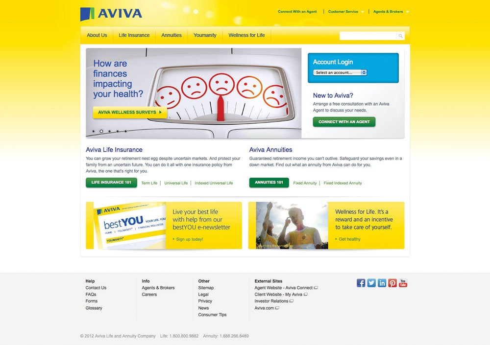
Rebranding AvivaUSA.com
AvivaUSA.com before the acquisition.
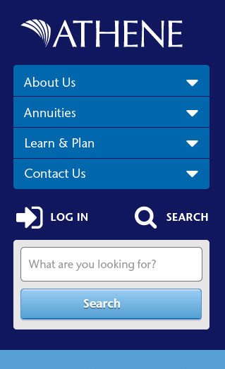
Athene had acquired Aviva USA, and we had to rebrand everything. I had been designing and building small responsive microsites for Aviva and we all agreed it was worth the effort to develop a new responsive theme for our public website. We only had a few months to complete all the work, so the customer and agent portals would remain on their existing fixed-width theme with simple changes of the colors and imagery.
Visual Design
The Athene brand was in a state of transition. Exploratory research was underway with a branding agency, but we couldn't wait months for new guidelines. The existing Athene collateral and sites felt somewhat cold and sterile, which was a huge change from Aviva's bright and sunny attitude. I explored different visual design options using Style Tiles. My main goal was to show the difference between the classic Athene look and an approach using some brighter colors. I was also advocating for a brand typeface that had a variety of weights and was easy to read
Prototype
We documented the current site structure, and worked through what content changes would be needed. I used then Axure to make an interactive wireframe prototype to show how users would navigate through the site.
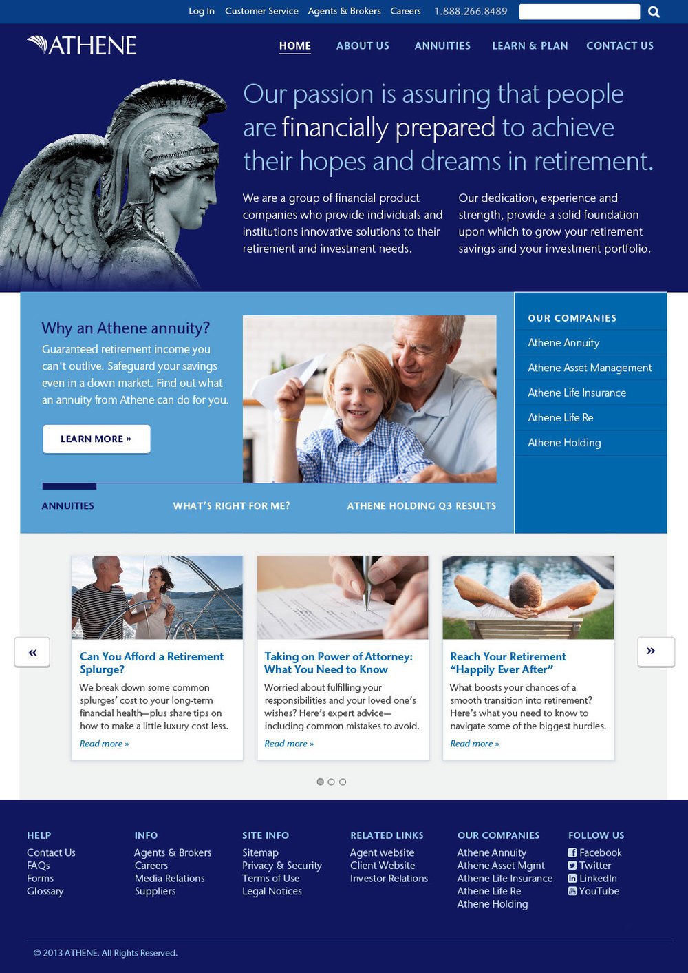
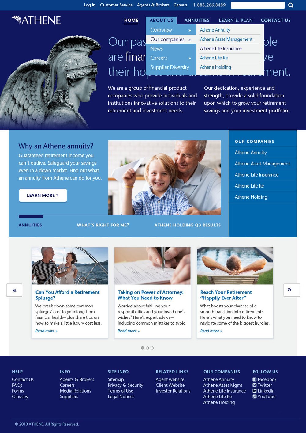
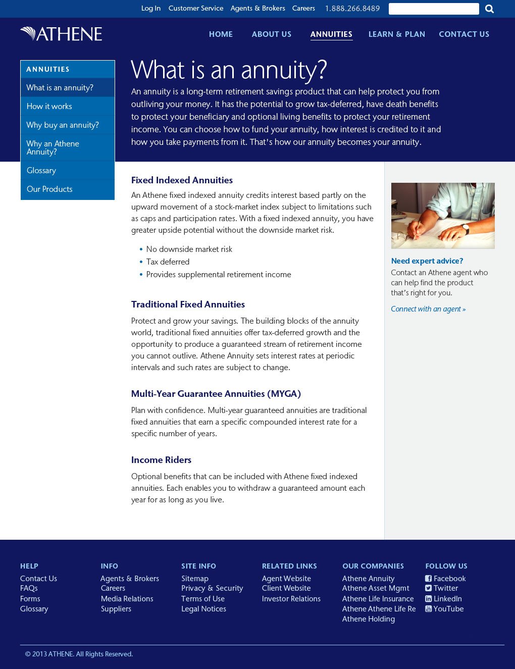
Final Designs:
After the wireframes were approved, I moved on to creating high fidelity mockups to tie in the visual design. These were used to get sign-off from stakeholders, and show developers different navigation states.
